Monday, 16 November 2009
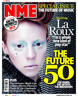
NME front cover analysis
The music magazine I have chosen to analyse is titled, “NME”, which stands for “New Musical Express”. This has been chosen as a pun as it pronounced ‘enemy,’ which is a persuasive technique to lure the reader in. The word “new” indicates that the music is the most latest and recent so it’s more or less “in fashion” and “in trend”. “Express” represents how fast the music news will get to the reader and that it is up to date. NME is Europe’s most successful music magazine, with 16 million consumers worldwide and is published by IPCMEDIA.
The masthead is always done in bold blood red writing which contrasts with the background, which consists of dark monotonous colours; black and grey, so that it stands out to the human eye. The colour choice also fits in with the genre of the magazine as NME’s target audience is for those late teens/young adults who are interested in the indie rock genre and the colours red and black (which are on the cover) are associated with the rock and roll theme. The cover line and key articles on the cover are also made to stand out, by the use of colour. The masthead always uses a more striking colour, in this case red, which symbolizes its importance so that it is made recognisable and can be easily remembered by the purchaser. To continue, the magazine has stuck to only using 3 main colours; red, black and yellow, which refines the magazine and makes it appear to be more stylish and sophisticated. This informs the reader that the magazine maybe fairly expensive.
The main image on the front cover is of an alternative artist called La Roux. The image is a close up and La Roux is directly addressing the audience (direct mode of address) as she is using eye contact to involve the reader, to make them feel that she is addressing them personally and that each reader is her main focus. The picture conveys La Roux to be ice cold, as her make up is very wintery and she appears to have icy pale skin and light blue eye makeup which also represents coldness and ice. The two gems on the side of her cheek almost look like rain drops, or ice, which also adds to the wintery feel of the image. This portrays La Roux to be a very serious person, as she is pouting and does not appear to show any emotion. The way her makeup has been done, also makes her look futuristic, yet her outfit (from what we can see of it), seems to be from the Victorian times. This suggests that perhaps La Roux feels that she is trapped in the wrong period of time.
On the magazine, the significant words are printed in large bold fonts which makes it clear to the reader what is going to be included in the issue and grabs the reader’s attention. “THE FUTURE 50” (the main cover line) captures the audience’s interest as it is very “in your face” and we know that it is a core feature/article in the magazine as it is featured yellow and is the largest text on the cover.
Thursday, 12 November 2009
Kerrang front cover analysis
The masthead, Kerrang is very effective as it is onomatopoeia for the sound of a guitar, this automatically connotes the genre of the magazine, which is rock. Kerrang also uses dark imagery to indicate this. The guitar is an instrument mainly used in rock music so the reader can identify the genre of the magazine just by looking at the mast head. The typography of the title is done in a font which looks like shattered glass. Some rock artists smash their guitars after performing and this type of font may represent that. The mast head is covered up by a large image of the band, Biffy Clyro. This tells the reader that this is a well known recognisable magazine because the publisher feels comfortable enough to sell it when the addressees cannot see the whole title.
The main feature is of Biffy Clyro in a mid shot straight on so the audience can get a full view of the musicians in the centre of the page. It is an overpowering image which dominates the cover and is very “in your face”. The picture is very intimidating as their stance is threatening as the image is made to look like it is coming off the page and is about to jump out at you. The two back up singers are dressed in black and the lead in white, this makes him stand out and seem more significant compared to the others. They all have long hair and beards which tells the audience that they want them to focus on their music and not their appearance. The long hair on the central band member seems to be blocking his face which may symbolise that he is insecure. It also suggests that he has something to hide or that there is another side to him which know one knows about. The musician’s clothing is closed, barely any skin is revealed which shows that perhaps they are self-doubting or possibly that their faces are supposed to be the core focus as they are looking directly at the audience and they don’t want any distractions. By looking at the audience, this makes them feel more involved with Biffy Clyro and that they are being looked at individually which makes them feel important. The tattoo on the central band member is there maybe to portray something that the band stands for/believe in.
Kerrang applies dark deep colours to the magazine, using the reoccurring theme of black, red and white. The cover line contrasts with the background as it is white against a black background. The lighting is dark and dim on the front page and shadowing is used around the smaller articles and pictures below the main feature which are all of rock groups. This links in with the target audience, obviously the magazine is designed for those who like rock music but we can tell it is for males as the colour scheme uses dark colours which are associated with masculinity.
The front cover is very organised and structured which makes it look like a more high class and expensive magazine. Most of the typography is done in bold which makes words such as “free” and “plus” stand out. They are also done in block capitals which highlights the text to make it even more eye catching.
Top of the Pops front cover analysis
The masthead of the magazine to the left is Top of the Pops. The title is important as it connotes that the magazine provides the best information about the most popular music at the current time. It is a clear title which emphasizes that “pop” is the best type of music. “Top” and “Pop” rhyme which makes the masthead easily remember able for the young target audience that the magazine tries to connect with. The core audience that the magazine is trying to pull in is of young girls- pre teens, between the ages of 11-15 years old. To tempt and draw attention to this market of people, the magazine uses the colour pink to convey femininity. Pink is a colour associated with girls so when a potential female sees this magazine, they will automatically know that this particular magazine is aimed at/ made for them. The bold statement of the colour pink is aesthetically attractive.
The front cover is very busy. There are lots of small images surrounding the key image which adds brightness and is more appealing to the eye as there is a lot to look at. This makes the reader think that they are getting what they pay for as there are lots of articles on the front. The price of the magazine is £2.85 and is published weekly. This amount of money could be classed as expensive as the target audience is for female children, and to them, as they don’t work or understand money, may feel that it is quite expensive. In comparison to fashion magazines such as Vogue, which is priced at £3.90, this magazine would be ranked as cheap. Despite this, the cover manipulates the reader by presenting the reader with all the articles on the front page to make the magazine seem full and bountiful.
By the cover we can tell that the magazine’s media interests are of’; television programmes, “X FACTOR”, bands and music artists, “Jonas Brothers”, the fashion industry, “ Fashion bargains” and young celebrities such as Taylor Swift. The publisher, the BBC (British Broadcasting Cooperation), have used a pun, “Taylor’s Swift snog”, which is comical as they are using the musicians name to describe her “snog”. This shows us that the magazine is light hearted. The Top of the Pops magazine is a product from the popular television show, Top of the Pops. The BBC has created this magazine in attempt to cater for a mass audience as the tax payer funds the BBC, in which they have been very successful, with a circulation (point of sell) of 119.739 people and with a readership of approximately 393000. 87% of readers are girls and 13% are boys, this makes it clear that the magazine is aimed at young girls.
The typography is bold and simple which makes it undemanding of the reader, who will be young so therefore hasn’t acquired a full set of skills which enables them to read without difficulty. The magazine uses childish language such as “OMG” to bond with the reader and lures the audience in with words like “exposed” to arouse curiosity. Words like “Win” persuades the target market to purchase the magazine as it gives them a chance to gain an extra something from the magazine, often a luxury, in which they can take away with them. The main cover line, “”No more secrets” Jonas Brothers come clean about everything” lures the reader in, along with such words as “Exposed”, as its offering them an insight on the lives of those people that the person who reads may aspire to be like. They can achieve extra knowledge and become apart of those select few who also know the information; it would be the equivalent to joining a secretive club.
The main image on the front page is of the pop/soft rock group, the Jonas Brothers. The mode of address is that the band is directly addressing the audience by using eye contact. The group also appear to be very friendly as they are smiling straight the reader and their appearance is open and more relaxed. They appear to be laughing which makes it look like that they are having a good time and enjoying themselves, and young influential children may aspire to be like this. This manipulates the audience into thinking that the Jonas Brothers are welcoming the reader into their lives, they have been invited to join in with the excitement that the Jonas Brothers have, it makes the reader feel more involved.
Subscribe to:
Posts (Atom)