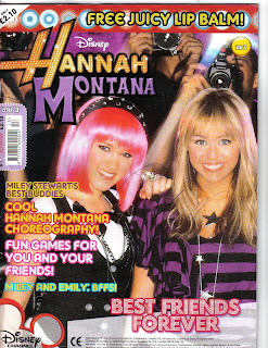
The masthead is on the top left hand corner of the magazine and is the name of the celebrity/musician, Hannah Montana, whom the magazine is based on. Hannah Montana is a hit Disney Channel show which is about a normal teen leading a secret double life as a pop star. The word “Hannah” is printed with an orange coloured font with bright yellow circles inside it and a few white sparkles. This makes it looks as if her name is lit up in lights, which make her seem more impressive, and exaggerates her fame and shows the audience that she is a celebrity and illustrious. The word “Montana” contrasts with “Hannah” as it is printed in a dark shade of purple, it is plain rather than glitzy. This represents that there are two sides of Hannah, as she leads two lives (one as Hannah and one as Miley).The colouring contrasts the different life styles she leads, one glamorous and one standard and also makes it look aesthetically attractive. The masthead is boarded with black to help it stand out against all the other colours featured on the front cover. This effect also makes it looked as if it is framed, and pictures/autographs of celebrities are often framed as some sort of prize, as celebrities are to be idolized.
The price of the magazine is £2.10 and above it says “only” which makes it seem as if its good value for money. This is a good price for the target audience, which is young girls. This is because they wont have much money as they would not have jobs at their young age or be receiving a significant amount of pocket money. As it is published monthly they wouldn’t have to spend too much money and can save up to purchase it. The magazine is published by Panini UK Ltd and the magazine itself is published monthly. Panini has its own website, http://www.paninionline.com/collectibles/institutional/bt/uk/, which contains information on other children books, sticker collections and trading cards.
The target audience for this magazine is of young girls- pre teens, between the ages of 10 and 13 whom like Hannah Montana, who is a pop artist. One reason of this is due to the bright bold images and the childish girly language used such as “cool” and “hey, peeps!” .As well as this, The advertisements featured in the magazine are toys for girls aspiring to be older, such as “Candy Bead Studio” and “Gourmet Fondant Cake”. This is so they can live up to be older just like Hannah and do the things that she does, such as make cakes and wear jewellery. We know that it is for girls because on the front is an image of Hannah and Lola (there are no boys featured) and the colours used are very girly; pinks, yellows and purples, which are feminine.
The main image and only image on the front cover is of Hannah and Lola (her best friend) being snapped by the paparazzi. They are both looking straight at the audience, they are smiling and their body language is open which is inviting and suggests that they are friendly and fun characters. This makes it seem as if they are giving the reader a warm welcome. They are wearing lots of makeup and sparkly accessorises which is visually attractive and catches the eye of the reader. The clothes they are wearing are quite dark with the theme of purple and black but the silver and sparkles highlight their outfits and bring them out more, which helps them stand out against the busy background of the paparazzi. This shows that the magazine have focussed on their appearance a great deal in order for young girls to aspire to be like Hannah and Lola.
It is a fairly busy front cover, not so much in the way that there is lot of content, but because of the fact that the main image takes up the whole page (which is an eventful image) and that there are a lot of clashing bold colours used. The use of lots of colour makes it seem very cheap as it looks like they have just been thrown on the page because there are so many different colours. Although, this will be appealing to young children as lots of colour is striking to the eye so they will automatically be attracted to it if they see lots of colour. At the top of the page there is a pug, “FREE JUICY LIP BALM”. This lures the reader in because the reader feels that they are getting more out of the magazine and it makes them feel privileged as they have something that Hannah Montana has, her special lip balm. The word “juicy” also makes the lip balm seem more appealing, it makes the lip balm seem more luscious, which is an adjective which makes the reader wanted to purchase the magazine so they can wear it.
Good analysis!!!
ReplyDelete