Monday, 14 December 2009

Q contents page analysis


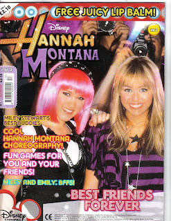
As you can see the contents page is organised into sections and is presented in a way which is very neat and tidy. This structure makes the magazine seem very professional. The content is written in columns which make it look like a newspaper, which again gives that professional and more mature appearance.
The colour scheme is red, black and white which fits in with the genre, indie rock. Red represents power, strength and danger and is a very bold and striking colour which will attract the reader’s attentions. Black is a very dark colour which can be associated with evil and mystery and white represents purity and innocence. Together, the three colours create a good balance of meaning which contrasts against one another in order to make each of the colours stand out and seem significant.
Q has decided to use only two pictures on the contents page, there is a lot of text to inform the reader what will be in the magazine and to make them know that they are getting a lot out of the magazine as it expensive at £3.99. The headings of each section are written in block capitals and are surrounded by red colouring to make it easier for the reader to find what they are looking for with ease. The numbering of the contents is also done in red to match the title and to make each feature written down stand out. Besides this the “OASIS SPECIAL!” feature is printed in gold to make it seem more important and imperative. An exclamation mark is also to reinforce and exaggerate its significance.
The photographed image of The Courteeners, takes up most of the page and is placed on the right hand side of the page, so when the reader opens the magazine, the image is the first thing that the audience will see and it makes the magazine more visually attractive. Although there is more text that images, the images printed are large so it still adds a good amount of colour to the page and takes up space. The images are very simplistic and seem more natural than posed, due to the environment which they are set in. The main image is on top of a hill in the countryside which creates a fresher and clean feel. The band is dressed in dark colours and their facial expressions seem serious which makes the band seem very mysterious as we are not getting much out of them. They are directly looking at the audience and there body language appears stern, they almost look threatening in a way as they are standing in a straight line with their hands in their pockets or by their sides which gives off the impression that they have not put much effort into their appearance and that they are reserved people.

Sunday, 13 December 2009

Hannah Montana Contents Page Analysis


The structure of the magazine is organised into sections. The main content is printed in text down the middle of the two pages in a lilac text box with the large heading: contents, in white. The title stands out against the background which is coloured in different shades of purple and is done in low case lettering in bubble writing to give off that young and fresh feel. Each sub heading in the contents table is written in bold so that the reader will pay more attention to it and find out what is involved. The numbering is made very clear so that young children can understand as it is placed separately from the writing so it doesn’t look too much and get the child confused. The headings and subtitles such as “Snapshot” and “Best Buddies” are done in a childish language, which is simple and easy to read. This type of language engages the reader as they can connect with it as they use that type of speech. As well as this, words such as “win” entice the reader because it automatically tells the reader that they can get something more out the magazine. The contents is printed in a plain font to make it easier for the child to read and take in, the words used are also short and straightforward so that the audience can comprehend what is being said.
Surrounding the contents, are various pictures to do with Hannah Montana and her television show. This brightens up the page and adds colour to liven up the magazine. The images link in with the contents so that the reader can visually see what the article is about and this will lure them in because they can see exactly what they are going to get out of the magazine. All the images of people, such as of Lola and Hannah, are smiling and having a good time and are directly addressing the reader to interact with them and this is the attitude that young girls will want to have as they aspire to be like Hannah. The colours that are used on the page all seem to be very feminine and swirly patterns and shapes are used to help the contents look more visually attractive.
Commenting more on the typography, words which are done in larger lettering are made to seem more significant, such as “Let’s Dance”. This is to ensure that the reader’s attention will be grabbed so that they will be drawn in and what to read on and find out more as the magazine has just given you a snatch of the article.
I liked the layout of the contents page as it was still amusing but not confusing. It wasn’t too busy and a great deal of colour was used which was eye catching and made the contents refreshing to look at and would attract the pre teen female audience.

Kerrang contents page analysis


The contents page is very neatly structured, the main contents details are placed down the right hand side in a tidy column and this is a good thing because it is the first thing you see when you turn the page. If your in a rush you can find what you want quickly because the article headings are numbered which creates easy access. The contents page is grouped into different categories which make it very well thought-out. Despite this, some of the numbered article titles are dotted around the centre of the page with large images to draw attention to them, which is quite confusing if your trying to find something specific, but then again you can just look at the pictures to find exactly what you are looking for. There is no dominant image of the band featured on the front cover, which is unusual as pop magazines such as Top of the Pops features the main musician on both prints. The different sections consist of the editor’s letter in the top left hand corner, a quote from the lead singer of a famous band sitting under the contents title, the contents itself and the subscription in the bottom right corner. The tone of the editor’s letter is informal, like he is talking to the reader as a friend, this draws them in because it seems like he is talking to them personally. The editor (Paul) signs the letter himself, he personalises it, which also makes him seem friendlier and an open person. In a way, this text stands out as it is the only text on the page which isn’t done in a large font, in caps lock or in bold, so in contrast to everything else, it stands out and is small because the audience want to focus on it more and it makes it seem like there isn’t much text to read so they are more likely to read it.
Lots of images of musicians are used to break up the text. There are two large pictures and four small ones which filter the text. One large image has been placed on the left along side with two smaller ones underneath it and on the right there are two smaller images at the top and one larger image beneath it, which creates a contrast. Some pictures are of musicians performing and they are not directly addressing the reader and these are the darker images which creates a more shady and threatening atmosphere and is more daring as other artists which aren’t seen as “popular” wouldn’t not look at the audience as they would not be known well enough. Additionally, the lighter images of the artists’ whom aren’t performing seem to be directly addressing the reader by using eye contact. The core audience like the fact that the music is live and realistic which has been captured in most of the images and not manufactured unlike some of the brighter images which look staged. For example, there is picture of the lead singer form the band, The Used, performing live on stage. Although he doesn’t look very appealing as he is sweating and hasn’t been touched up, the viewers like this because it is a realistic representation of the genre and the image captures what the artist actually has to go through. This shows that the reader cares about the music and not the appearance of the artist. The lighter and more comical images adds colour to the page and grabs the eye of the viewer and takes away some of the seriousness of the darker images to try and create a more upbeat and happy atmosphere. Bordering the images are thin grey shadows which make the images appear to be framed which adds importance to them as usually significant photos and images are framed.
The typography of the written text down the contents column is done in capitals and the headings of each section in bold which makes it clear and stands out in contrast to the images. This way, the reader can identify quickly what specific section they are looking for as the layout is large and easy to follow. The text is straight to the point as there is no extra/ unnecessary wording, just a small word/phrase so the reader knows exactly what is there and what they are looking at/for, which consequently saves time. The semi titles of each section (the headings) are printed in yellow and black, as well as the numbering as this helps it stand out against the white background. Kerrang have used a consistent font throughout their contents page which makes it look less tacky and more sophisticated. The page is busy but not messy as nothing is overlapping but there is a great deal of content which proves that the customer is getting value for money.
Black is a key colour, it is used on the front cover and symbolizes a typical rock cover. Yellow is used alongside the black which is a bright contrast, it helps us see the headings and semi titles more clearly as the yellow stands out against the black.
I like the fact that the reader can skim through the contents and find what they intended to/ anything that might catch their eye with ease as there is no unnecessary wording to bulk up the text, which will make the reader loose focus. Besides this, I feel that the structure is a bit too organized. I think that this layout and style doesn’t fit in with the rock genre, but as it is an established magazine it had to build a format, which is simplistic yet effective as the magazine just focus’s on the music, which is a good set up.
Hannah Montana magazine front cover analysis


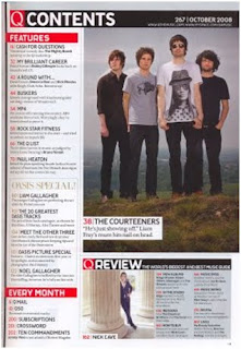
The masthead is on the top left hand corner of the magazine and is the name of the celebrity/musician, Hannah Montana, whom the magazine is based on. Hannah Montana is a hit Disney Channel show which is about a normal teen leading a secret double life as a pop star. The word “Hannah” is printed with an orange coloured font with bright yellow circles inside it and a few white sparkles. This makes it looks as if her name is lit up in lights, which make her seem more impressive, and exaggerates her fame and shows the audience that she is a celebrity and illustrious. The word “Montana” contrasts with “Hannah” as it is printed in a dark shade of purple, it is plain rather than glitzy. This represents that there are two sides of Hannah, as she leads two lives (one as Hannah and one as Miley).The colouring contrasts the different life styles she leads, one glamorous and one standard and also makes it look aesthetically attractive. The masthead is boarded with black to help it stand out against all the other colours featured on the front cover. This effect also makes it looked as if it is framed, and pictures/autographs of celebrities are often framed as some sort of prize, as celebrities are to be idolized.
The price of the magazine is £2.10 and above it says “only” which makes it seem as if its good value for money. This is a good price for the target audience, which is young girls. This is because they wont have much money as they would not have jobs at their young age or be receiving a significant amount of pocket money. As it is published monthly they wouldn’t have to spend too much money and can save up to purchase it. The magazine is published by Panini UK Ltd and the magazine itself is published monthly. Panini has its own website, http://www.paninionline.com/collectibles/institutional/bt/uk/, which contains information on other children books, sticker collections and trading cards.
The target audience for this magazine is of young girls- pre teens, between the ages of 10 and 13 whom like Hannah Montana, who is a pop artist. One reason of this is due to the bright bold images and the childish girly language used such as “cool” and “hey, peeps!” .As well as this, The advertisements featured in the magazine are toys for girls aspiring to be older, such as “Candy Bead Studio” and “Gourmet Fondant Cake”. This is so they can live up to be older just like Hannah and do the things that she does, such as make cakes and wear jewellery. We know that it is for girls because on the front is an image of Hannah and Lola (there are no boys featured) and the colours used are very girly; pinks, yellows and purples, which are feminine.
The main image and only image on the front cover is of Hannah and Lola (her best friend) being snapped by the paparazzi. They are both looking straight at the audience, they are smiling and their body language is open which is inviting and suggests that they are friendly and fun characters. This makes it seem as if they are giving the reader a warm welcome. They are wearing lots of makeup and sparkly accessorises which is visually attractive and catches the eye of the reader. The clothes they are wearing are quite dark with the theme of purple and black but the silver and sparkles highlight their outfits and bring them out more, which helps them stand out against the busy background of the paparazzi. This shows that the magazine have focussed on their appearance a great deal in order for young girls to aspire to be like Hannah and Lola.
It is a fairly busy front cover, not so much in the way that there is lot of content, but because of the fact that the main image takes up the whole page (which is an eventful image) and that there are a lot of clashing bold colours used. The use of lots of colour makes it seem very cheap as it looks like they have just been thrown on the page because there are so many different colours. Although, this will be appealing to young children as lots of colour is striking to the eye so they will automatically be attracted to it if they see lots of colour. At the top of the page there is a pug, “FREE JUICY LIP BALM”. This lures the reader in because the reader feels that they are getting more out of the magazine and it makes them feel privileged as they have something that Hannah Montana has, her special lip balm. The word “juicy” also makes the lip balm seem more appealing, it makes the lip balm seem more luscious, which is an adjective which makes the reader wanted to purchase the magazine so they can wear it.