1. Who would be the audience for your media product?
The concept of audience is very complex as there are different types. You can get core, secondary, mass, niche and target audiences. All of these concepts describe a type of audience and you will find different types of audiences are looked at for different things. For example if I was to make a magazine for Grime music lovers, my audience would be called a “niche” audience, meaning small, as Grime is not a mainstream type of music so there will not be a high number of addressees. The target audience for my magazine is for young teenage girls between the ages of 12 and 15. This links in with the chosen genre, Pop, as the result of my questionnaire told me that the majority of my target audience preferred this genre. I choose this genre and target audience as I thought they interlinked very well with each other and as growing up from my teens, I understand and recognise what this type of audience would want and demand from a music magazine. As well as this, the Pop genre has a mainstream market so I would be able to follow up on the genre and collect a lot of relevant research. . What audience you have changes what your magazine looks like and the ideologies. Conventions such as the colour pink are used throughout my magazine as this is a feminine colour and fits in with the Pop genre. Light feminine colours would not be successful on a rock magazine for example as they are aimed at an older audience and dark more serious colours are a key element for this type of magazine.
2. How did you attract / address your audience?
The layout, presentation, colour scheme and model on the front cover
are the features that attract your audience first. Therefore, your front cover has to stand out against other magazines of the same genre. I looked at Top of the Pops and the Hannah Montana magazine for ideas as they are from the same genre and has target the same audience. I also approached the public with a questionnaire which I had created myself and used a mixture of set questions and open questions to get a fuller more accurate view on the person’s preferences. As my audience was for young females, I had to use the appropriate images to attract their attention. I had to use someone that they would look up to and aspire to be like, whom were suitable role models, and who were people to be admired and friendly looking. I choose to take pictures of a girl band named, Rock $ Dollar. Their clothing had to be covering the body in order to create a respectful look and to attract the right audience. For instant if I had the three of them wearing revealing clothing then it might be a focus for a male audience. The clothing worn involved lots of different colours and patterns such as pink, blue and white to create a more colourful image which would be more appealing to the human eye. I noticed on magazines such as Top of the Pops, lots of colours were used and this was because bright bold pictures and images draw in their particular target audience, which happens to be the same as mine, 12- 15 year old females. The cover lines consisted of colloquial language which attracted the audience as they were able to relate to it. Words such as “diva” and “lip balm” were printed in a larger font and were coloured to make them appear bold and more eye catching. I also enlarged words such as “free” in order to lure the reader in. This helps persuade the audience to purchase the magazine as they feel that they would be getting more that they paid for from it. The mode of address my models were using was to look directly at the audience, apart from one model whom was looking down but was still smiling. This was to engage with the audience, to make them feel a sense of belonging to the magazine and that they individually were significant and important. The models were made to look very welcoming by holding open poses and gestures which were not defensive and were free. Their facial expressions were very friendly, they were smiling and looking as if they were having fun and having a good time, which girls from my target audience would like to do. The fonts I have used throughout are large, floating pieces of “bubble” writing which are bold and easy to read. I have written in bright colours as colours such as pink and purple represent youth and pop culture. However, in some cases I have used black writing to contrast with the bright backgrounds in order for the writing to be clear and stand out in comparison. The printed text is childish and simple and very feminine. For example on the front cover I have used the words, “hunky heart throb”, which is alliteration as the first two words start with the same letter and therefore creates a type of tongue twister. This language is childish yet for my target audience; it may be seen as grown up as the context of the writing is about a boy. From the age of 12 and upwards girls are starting to be introduced to boys as people that could potentially be more than friends once puberty starts so they may feel more mature and adult.
3. In what ways does your media product use, develop or challenge forms and conventions of real media products?
One convention I have challenged in comparison to real media products such as Smash Hits and Top of the Pops magazine is that I have used only one main image on the front cover. However, I believe that it will still be successful due to the fact that I have used a lot of colour and a variety of different colours. I have developed the use of colours as the colour scheme on my front colour involves 6 different colours, which is a lot compared to other magazines which use the maximum of around 4. I have used pink, blue, lilac, yellow, white and black which has helped my magazine to appear more visually attractive, despite the fact that I have only one key image. The reason why I challenged this convention was because of the fact that an equal number of persons asked in my questionnaire liked the idea of using only one key image. However, I have reinforced the stereotype of a happy smiling and inviting model on the front cover to help create an upbeat atmosphere and child friendly image which is appealing to the human eye. This is a typical image that ties in with the genre, to have a pretty girl featured on the front cover, which I found on all Pop magazines I looked at, such as on Top of the Pops magazine. On one front cover I saw a tall, slim, blonde, young female posing using open body language and was smiling which towered over the other images making her seem more important and emphasised her beauty. The Pop genre appeals to a female audience so I made sure that I featured female models and issues so that the audience could communicate with them.
4. How does your media product represent different social groups?
My target audience is for females between the ages of approximately 12 and 15. I feel that my magazine has been dominated by White females and has been centred around them. This is because my magazine hasn’t featured any Black or any other females from a different ethnic group other than White British. Throughout the magazine there has been no Black role model for example or any issues featured that those from specific ethnic groups may face. The typical female of this age group would be immediately attracted to the magazine due to the corresponding colour scheme of pink, baby blue, and purple. These are all fun, feminine colours so males would not be attracted to this magazine.
In order to design my magazine I looked at Top of the Pops and Hannah Montana magazine for inspiration. Both magazines used a lot of colour so I knew I had to include the element of colour. As well as this, lots of images where used and little text so I had to adopt these ideas to my magazine in order for it to be successful and connect with my target audience.
The front cover features a girl band so female girls will relate to them and therefore want to read the magazine. The front cover image is very enticing as the girls are smiling and having fun which is what the target audience will aspire to be similar to. The girl band is decently dressed (the clothing is not revealing) therefore, it is suitable for the target age group. They are not portrayed in a seductive way so males will not be attracted to it and girls will not be pushed away.
I have challenged the dominant representation of a bright background colour for the front cover by using white as I wanted the band to be the colour focus and wanted the group to stand out in comparison. This also accentuates the image and creates the atmosphere that the band is dominating the page with colour.
If I was to do it differently I would choose a completely different colour scheme to perhaps target a higher aged female teen as well as the younger ones. This is because I could have more of my own personal input as I would be closer to that age so I would know what the target audience would personally want.
5. What kind of media institution might distribute your media product and why?
Personally, I would approach a publishing company such as IPCMEDIA as it doesn’t produce any type of pop magazine so then my magazine could potentially fill the gap in the market. IPCMEDIA produces rock magazines such as NME which have become very victorious, so if I go to them then they may be persuaded to try something new and challenge themselves by attempting to make a Pop magazine successful and perhaps create their company a whole new image which caters for a whole variety of genres. However, I could go to such publishers as the BBC as they have experience in selling pop magazines such as Top of the Pops so then they would know exactly what my magazine would need in order to sell and appeal to my target audience. They will know exactly what I need for point of sell in order to draw customers in and where to sell them, such as newsagents and supermarkets.
6. What have you learnt about technologies from the process of constructing this product?
One thing I have learnt is not for me, the producer, to be in the images need for the magazine, as I wasn’t able to take the pictures so resulted to putting them on self timer and positioning the camera accordingly. This was a time consuming and rather difficult process as after every shot I had to reposition the camera in order to get the framing right. As well as this, I learnt that I needed a very high-quality quality camera as some of my pictures came out pixelated so then I had to re do my photo shoot and borrow my friends camera in order to take better quality images which were easier to edit. Photoshop was a very hard piece of software to use as there were a very large amount of tools and none of them had what each tool’s purpose was next to them or anything explaining how each device worked or how to use them. In order to over come the issues with Photoshop, I just had to practice. I did this by experimenting with buttons which I didn’t know what they did in order to enhance an image, just so I could get the hang of it before I edited my own images. At first I was having difficulty with cutting around the appropriate part of the image I wanted to be featured on my work but then I discovered the Magic Wand tool which cut around big chunks by separating the background from the key image. I also struggled with cropping out the backgrounds to make it blend in with the Photoshop document but then I learnt that if I zoomed in closer, it was easier to see as it was much clearer. I also learnt how to use a blog. We uploaded all our work, research and planning onto an internet blog where people could view our work and this was also a new experience. The blogging site we used, www.blogger.com , was thankfully very straightforward and simple to use. Buttons were labelled clearly and the blog itself seemed to be vey basic but you could chose the layout of your blog, such as choosing from a variety of backgrounds to make your blog appear more visually attractive and you could upload photos, word documents and videos. Uploading work onto a blog is a very good way of storing it, the website auto saves your work every few minutes so you are less likely to loose work and it is easily accessible. Users can also follow other people’s blogs and it is very user friendly and you don’t even have to be a member to see member’s blogs and posts.
7. Looking back at your preliminary task, what do you feel you have learnt in the progression from it to the full production?
Looking back at my preliminary task I have definitely improved on my Photoshop skills and learnt how to fill up space in an appropriate manor and have become more imaginative and put my self in the readers position and thought to myself would I really buy that and what would I like to see and if the magazine feature would appeal to me. My final contents page uses more images, so its more eye catching, I have tried to use space wisely and fill it up with the appropriate content and to make it look more visually attractive. I have also used more text on the front cover and this is so the reader will know exactly what they are getting from the magazine so it looks like they are getting a good deal for what they are paying for. The quality of the pictures produced are now much more clearer and crisp as I have used a better quality camera which makes my images appear to be more professional. My confidence has improved drastically when using Photoshop. Although it is a long process, I have been able to experiment on text and images with more assurance such as on my double page spread, “Choreography with Chloe”, I found a tool to make the text multi coloured and more bold to give it that diva effect, making it more striking to the eye and more flashy. I have familiarised myself with more of the tools and know how to use them appropriately. I have also been able to help out others such as showing them how to cover up spots which is done by a tool which looks like a plaster which takes the skin colour surrounding the marked area and glazes over it with the matching colour of the skin. Another thing I have learnt is how to scale the image so it is evenly proportioned, which I didn’t know how to do on my practice cover. This time on all my images I have used a tool which looks like a paper clip which takes the selected image and keeps it balanced and equal, no
matter how small or big you make it.
Overall I have learnt a great deal on how to create a successful magazine using Photoshop and all about the hard work which goes into it, including research, planning and production stages.
Monday, 8 February 2010
Friday, 5 February 2010
Thursday, 4 February 2010
Music Magazine Questionnaire Analysis
In order to find out exactly what my target audience demands from a magazine I undertook a questionnaire to show me their preferences and to help me discover the essentials needed to create a successful music magazine. Below you will see my results and findings which will help me design and create a suitable magazine.
Q1. Age
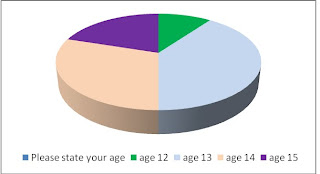
The first question I asked was about age. I asked each person to state their age and this was to help me find out who my target audience was. My results show that the individuals asked were aged between 12 and 15 and therefore this age group shapes my target audience. One person was aged 12, four were aged 13, three were aged 14 and two were aged 15. My results are shown in the graph below:
Q2. Gender
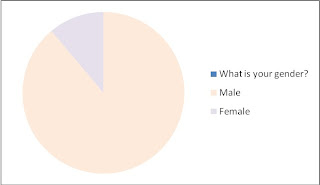
Secondly, I asked the participants to state their gender. My results show that the majority of the people asked were female, with 8 people questioned and that the minority of people asked were male, with two people asked. This indicates that my magazine should be dedicated to females as I will know more about their preferences.
Q3. Genre
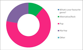
I needed to find out what music genre my target audience were most interested in; if I choose a genre which didn’t apply to them then my music magazine would not be successful. One individual chose Rock, two chose Hip Hop and seven chose pop. This clearly states that the genre that my target audience is interested in is Pop, so therefore this is the genre which my magazine will be based on.
Q4. Colours
The colour scheme of a magazine is very important because this is the element which makes the cover different from other magazines. I asked each participant to pick three colours which they would like to see on a music magazine and the most popular colours were pink, peach and lilac which all got 6 votes each. The least popular colour was black, with 1 tick, then it was green and blue with 2 ticks each and then it was red with 3 ticks and then the option “other” got 4 ticks. This tells me that I should be using the colours pink, lilac and peach to appeal to my target audience.

Q5. Images
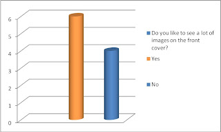
My fifth question asked the individuals to specify whether they preferred the front cover to have lots of images on or just one or a few. My results told me that 6 people wanted to see a lot of images and 4 people didn’t. The gap between these sets of results isn’t very large so this tells me that my magazine will still be successful if I choose to use a lot of images or not.
Q6. Favourite artist/band
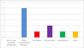
I then asked the persons to state who their favourite artists/bands were. This was to help me find out what type of artist I should put on the front cover. The majority of people chose Miley Cyrus/Hannah Montana (5), then came The Saturdays with 2 ticks, and then the Jonas Brothers and the Foo Fighters and the option “other” got 1 tick each. This indicates that my target audience are inspired and admire female role models so therefore I should put a female artist/group on my front cover so that my target audience can relate to them and are attracted to the cover at first glance.
Q7. How often the magazine should be published
The seventh question asked the individuals how often they think a music magazine should be published. The options were between weekly and monthly and they both got an equal of 5 votes each. This reveals to me that if I publish the magazine either monthly or weekly it will be in my favour nevertheless as an equal amount of people prefer it either way.

Q8. Price
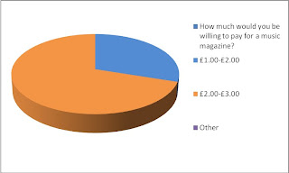
Next, I asked the people taking the questionnaire “How much would you be willing to pay for a music magazine?” 8 people stated that they were willing to pay £2-3.00 and 3 were willing to pay £1-2.00. This helped me to decided on the price of £2.50 as the majority of people asked were willing to pay £2-3.00 so I know that they are able to afford it and it is at a suitable price which will still make me a profit as it is exactly half way between £2.00 and £3.00.
Q9. Layout
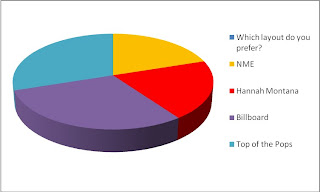
The final question I asked the individuals was to pick the layout they most preferred form the magazines; NME, Hannah Montana, Millboard and Top of the Pops. 3 people chose Top of the Pops and Billboard and 2 people chose NME and Hannah Montana. I also asked them why they chose the layout they did and what came up most was the fact that they like the colour scheme and the fact that they neither had a lot of images or that the magazine only had one main image to focus on. This shows me that I can either use one image or a lot of images as both will target my mass audience.
Q1. Age
The first question I asked was about age. I asked each person to state their age and this was to help me find out who my target audience was. My results show that the individuals asked were aged between 12 and 15 and therefore this age group shapes my target audience. One person was aged 12, four were aged 13, three were aged 14 and two were aged 15. My results are shown in the graph below:

Q2. Gender
Secondly, I asked the participants to state their gender. My results show that the majority of the people asked were female, with 8 people questioned and that the minority of people asked were male, with two people asked. This indicates that my magazine should be dedicated to females as I will know more about their preferences.

Q3. Genre
I needed to find out what music genre my target audience were most interested in; if I choose a genre which didn’t apply to them then my music magazine would not be successful. One individual chose Rock, two chose Hip Hop and seven chose pop. This clearly states that the genre that my target audience is interested in is Pop, so therefore this is the genre which my magazine will be based on.

Q4. Colours
The colour scheme of a magazine is very important because this is the element which makes the cover different from other magazines. I asked each participant to pick three colours which they would like to see on a music magazine and the most popular colours were pink, peach and lilac which all got 6 votes each. The least popular colour was black, with 1 tick, then it was green and blue with 2 ticks each and then it was red with 3 ticks and then the option “other” got 4 ticks. This tells me that I should be using the colours pink, lilac and peach to appeal to my target audience.

Q5. Images
My fifth question asked the individuals to specify whether they preferred the front cover to have lots of images on or just one or a few. My results told me that 6 people wanted to see a lot of images and 4 people didn’t. The gap between these sets of results isn’t very large so this tells me that my magazine will still be successful if I choose to use a lot of images or not.

Q6. Favourite artist/band
I then asked the persons to state who their favourite artists/bands were. This was to help me find out what type of artist I should put on the front cover. The majority of people chose Miley Cyrus/Hannah Montana (5), then came The Saturdays with 2 ticks, and then the Jonas Brothers and the Foo Fighters and the option “other” got 1 tick each. This indicates that my target audience are inspired and admire female role models so therefore I should put a female artist/group on my front cover so that my target audience can relate to them and are attracted to the cover at first glance.

Q7. How often the magazine should be published
The seventh question asked the individuals how often they think a music magazine should be published. The options were between weekly and monthly and they both got an equal of 5 votes each. This reveals to me that if I publish the magazine either monthly or weekly it will be in my favour nevertheless as an equal amount of people prefer it either way.

Q8. Price
Next, I asked the people taking the questionnaire “How much would you be willing to pay for a music magazine?” 8 people stated that they were willing to pay £2-3.00 and 3 were willing to pay £1-2.00. This helped me to decided on the price of £2.50 as the majority of people asked were willing to pay £2-3.00 so I know that they are able to afford it and it is at a suitable price which will still make me a profit as it is exactly half way between £2.00 and £3.00.

Q9. Layout
The final question I asked the individuals was to pick the layout they most preferred form the magazines; NME, Hannah Montana, Millboard and Top of the Pops. 3 people chose Top of the Pops and Billboard and 2 people chose NME and Hannah Montana. I also asked them why they chose the layout they did and what came up most was the fact that they like the colour scheme and the fact that they neither had a lot of images or that the magazine only had one main image to focus on. This shows me that I can either use one image or a lot of images as both will target my mass audience.

Subscribe to:
Comments (Atom)


