Q1. Age
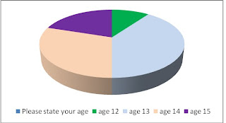
The first question I asked was about age. I asked each person to state their age and this was to help me find out who my target audience was. My results show that the individuals asked were aged between 12 and 15 and therefore this age group shapes my target audience. One person was aged 12, four were aged 13, three were aged 14 and two were aged 15. My results are shown in the graph below:
Q2. Gender
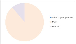
Secondly, I asked the participants to state their gender. My results show that the majority of the people asked were female, with 8 people questioned and that the minority of people asked were male, with two people asked. This indicates that my magazine should be dedicated to females as I will know more about their preferences.
Q3. Genre
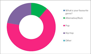
I needed to find out what music genre my target audience were most interested in; if I choose a genre which didn’t apply to them then my music magazine would not be successful. One individual chose Rock, two chose Hip Hop and seven chose pop. This clearly states that the genre that my target audience is interested in is Pop, so therefore this is the genre which my magazine will be based on.
Q4. Colours
The colour scheme of a magazine is very important because this is the element which makes the cover different from other magazines. I asked each participant to pick three colours which they would like to see on a music magazine and the most popular colours were pink, peach and lilac which all got 6 votes each. The least popular colour was black, with 1 tick, then it was green and blue with 2 ticks each and then it was red with 3 ticks and then the option “other” got 4 ticks. This tells me that I should be using the colours pink, lilac and peach to appeal to my target audience.

Q5. Images
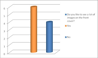
My fifth question asked the individuals to specify whether they preferred the front cover to have lots of images on or just one or a few. My results told me that 6 people wanted to see a lot of images and 4 people didn’t. The gap between these sets of results isn’t very large so this tells me that my magazine will still be successful if I choose to use a lot of images or not.
Q6. Favourite artist/band
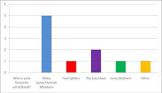
I then asked the persons to state who their favourite artists/bands were. This was to help me find out what type of artist I should put on the front cover. The majority of people chose Miley Cyrus/Hannah Montana (5), then came The Saturdays with 2 ticks, and then the Jonas Brothers and the Foo Fighters and the option “other” got 1 tick each. This indicates that my target audience are inspired and admire female role models so therefore I should put a female artist/group on my front cover so that my target audience can relate to them and are attracted to the cover at first glance.
Q7. How often the magazine should be published
The seventh question asked the individuals how often they think a music magazine should be published. The options were between weekly and monthly and they both got an equal of 5 votes each. This reveals to me that if I publish the magazine either monthly or weekly it will be in my favour nevertheless as an equal amount of people prefer it either way.

Q8. Price
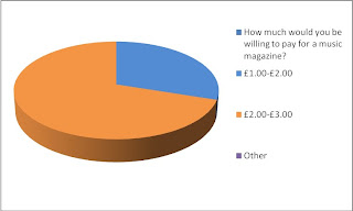
Next, I asked the people taking the questionnaire “How much would you be willing to pay for a music magazine?” 8 people stated that they were willing to pay £2-3.00 and 3 were willing to pay £1-2.00. This helped me to decided on the price of £2.50 as the majority of people asked were willing to pay £2-3.00 so I know that they are able to afford it and it is at a suitable price which will still make me a profit as it is exactly half way between £2.00 and £3.00.
Q9. Layout
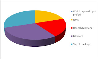
The final question I asked the individuals was to pick the layout they most preferred form the magazines; NME, Hannah Montana, Millboard and Top of the Pops. 3 people chose Top of the Pops and Billboard and 2 people chose NME and Hannah Montana. I also asked them why they chose the layout they did and what came up most was the fact that they like the colour scheme and the fact that they neither had a lot of images or that the magazine only had one main image to focus on. This shows me that I can either use one image or a lot of images as both will target my mass audience.
No comments:
Post a Comment