Monday, 14 December 2009

Q contents page analysis


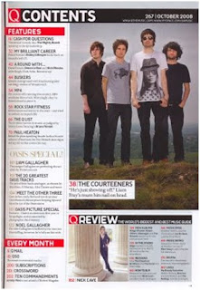
As you can see the contents page is organised into sections and is presented in a way which is very neat and tidy. This structure makes the magazine seem very professional. The content is written in columns which make it look like a newspaper, which again gives that professional and more mature appearance.
The colour scheme is red, black and white which fits in with the genre, indie rock. Red represents power, strength and danger and is a very bold and striking colour which will attract the reader’s attentions. Black is a very dark colour which can be associated with evil and mystery and white represents purity and innocence. Together, the three colours create a good balance of meaning which contrasts against one another in order to make each of the colours stand out and seem significant.
Q has decided to use only two pictures on the contents page, there is a lot of text to inform the reader what will be in the magazine and to make them know that they are getting a lot out of the magazine as it expensive at £3.99. The headings of each section are written in block capitals and are surrounded by red colouring to make it easier for the reader to find what they are looking for with ease. The numbering of the contents is also done in red to match the title and to make each feature written down stand out. Besides this the “OASIS SPECIAL!” feature is printed in gold to make it seem more important and imperative. An exclamation mark is also to reinforce and exaggerate its significance.
The photographed image of The Courteeners, takes up most of the page and is placed on the right hand side of the page, so when the reader opens the magazine, the image is the first thing that the audience will see and it makes the magazine more visually attractive. Although there is more text that images, the images printed are large so it still adds a good amount of colour to the page and takes up space. The images are very simplistic and seem more natural than posed, due to the environment which they are set in. The main image is on top of a hill in the countryside which creates a fresher and clean feel. The band is dressed in dark colours and their facial expressions seem serious which makes the band seem very mysterious as we are not getting much out of them. They are directly looking at the audience and there body language appears stern, they almost look threatening in a way as they are standing in a straight line with their hands in their pockets or by their sides which gives off the impression that they have not put much effort into their appearance and that they are reserved people.

Sunday, 13 December 2009

Hannah Montana Contents Page Analysis


The structure of the magazine is organised into sections. The main content is printed in text down the middle of the two pages in a lilac text box with the large heading: contents, in white. The title stands out against the background which is coloured in different shades of purple and is done in low case lettering in bubble writing to give off that young and fresh feel. Each sub heading in the contents table is written in bold so that the reader will pay more attention to it and find out what is involved. The numbering is made very clear so that young children can understand as it is placed separately from the writing so it doesn’t look too much and get the child confused. The headings and subtitles such as “Snapshot” and “Best Buddies” are done in a childish language, which is simple and easy to read. This type of language engages the reader as they can connect with it as they use that type of speech. As well as this, words such as “win” entice the reader because it automatically tells the reader that they can get something more out the magazine. The contents is printed in a plain font to make it easier for the child to read and take in, the words used are also short and straightforward so that the audience can comprehend what is being said.
Surrounding the contents, are various pictures to do with Hannah Montana and her television show. This brightens up the page and adds colour to liven up the magazine. The images link in with the contents so that the reader can visually see what the article is about and this will lure them in because they can see exactly what they are going to get out of the magazine. All the images of people, such as of Lola and Hannah, are smiling and having a good time and are directly addressing the reader to interact with them and this is the attitude that young girls will want to have as they aspire to be like Hannah. The colours that are used on the page all seem to be very feminine and swirly patterns and shapes are used to help the contents look more visually attractive.
Commenting more on the typography, words which are done in larger lettering are made to seem more significant, such as “Let’s Dance”. This is to ensure that the reader’s attention will be grabbed so that they will be drawn in and what to read on and find out more as the magazine has just given you a snatch of the article.
I liked the layout of the contents page as it was still amusing but not confusing. It wasn’t too busy and a great deal of colour was used which was eye catching and made the contents refreshing to look at and would attract the pre teen female audience.

Kerrang contents page analysis


The contents page is very neatly structured, the main contents details are placed down the right hand side in a tidy column and this is a good thing because it is the first thing you see when you turn the page. If your in a rush you can find what you want quickly because the article headings are numbered which creates easy access. The contents page is grouped into different categories which make it very well thought-out. Despite this, some of the numbered article titles are dotted around the centre of the page with large images to draw attention to them, which is quite confusing if your trying to find something specific, but then again you can just look at the pictures to find exactly what you are looking for. There is no dominant image of the band featured on the front cover, which is unusual as pop magazines such as Top of the Pops features the main musician on both prints. The different sections consist of the editor’s letter in the top left hand corner, a quote from the lead singer of a famous band sitting under the contents title, the contents itself and the subscription in the bottom right corner. The tone of the editor’s letter is informal, like he is talking to the reader as a friend, this draws them in because it seems like he is talking to them personally. The editor (Paul) signs the letter himself, he personalises it, which also makes him seem friendlier and an open person. In a way, this text stands out as it is the only text on the page which isn’t done in a large font, in caps lock or in bold, so in contrast to everything else, it stands out and is small because the audience want to focus on it more and it makes it seem like there isn’t much text to read so they are more likely to read it.
Lots of images of musicians are used to break up the text. There are two large pictures and four small ones which filter the text. One large image has been placed on the left along side with two smaller ones underneath it and on the right there are two smaller images at the top and one larger image beneath it, which creates a contrast. Some pictures are of musicians performing and they are not directly addressing the reader and these are the darker images which creates a more shady and threatening atmosphere and is more daring as other artists which aren’t seen as “popular” wouldn’t not look at the audience as they would not be known well enough. Additionally, the lighter images of the artists’ whom aren’t performing seem to be directly addressing the reader by using eye contact. The core audience like the fact that the music is live and realistic which has been captured in most of the images and not manufactured unlike some of the brighter images which look staged. For example, there is picture of the lead singer form the band, The Used, performing live on stage. Although he doesn’t look very appealing as he is sweating and hasn’t been touched up, the viewers like this because it is a realistic representation of the genre and the image captures what the artist actually has to go through. This shows that the reader cares about the music and not the appearance of the artist. The lighter and more comical images adds colour to the page and grabs the eye of the viewer and takes away some of the seriousness of the darker images to try and create a more upbeat and happy atmosphere. Bordering the images are thin grey shadows which make the images appear to be framed which adds importance to them as usually significant photos and images are framed.
The typography of the written text down the contents column is done in capitals and the headings of each section in bold which makes it clear and stands out in contrast to the images. This way, the reader can identify quickly what specific section they are looking for as the layout is large and easy to follow. The text is straight to the point as there is no extra/ unnecessary wording, just a small word/phrase so the reader knows exactly what is there and what they are looking at/for, which consequently saves time. The semi titles of each section (the headings) are printed in yellow and black, as well as the numbering as this helps it stand out against the white background. Kerrang have used a consistent font throughout their contents page which makes it look less tacky and more sophisticated. The page is busy but not messy as nothing is overlapping but there is a great deal of content which proves that the customer is getting value for money.
Black is a key colour, it is used on the front cover and symbolizes a typical rock cover. Yellow is used alongside the black which is a bright contrast, it helps us see the headings and semi titles more clearly as the yellow stands out against the black.
I like the fact that the reader can skim through the contents and find what they intended to/ anything that might catch their eye with ease as there is no unnecessary wording to bulk up the text, which will make the reader loose focus. Besides this, I feel that the structure is a bit too organized. I think that this layout and style doesn’t fit in with the rock genre, but as it is an established magazine it had to build a format, which is simplistic yet effective as the magazine just focus’s on the music, which is a good set up.

Hannah Montana magazine front cover analysis


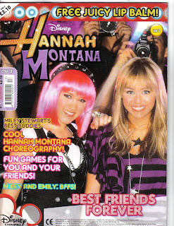
The masthead is on the top left hand corner of the magazine and is the name of the celebrity/musician, Hannah Montana, whom the magazine is based on. Hannah Montana is a hit Disney Channel show which is about a normal teen leading a secret double life as a pop star. The word “Hannah” is printed with an orange coloured font with bright yellow circles inside it and a few white sparkles. This makes it looks as if her name is lit up in lights, which make her seem more impressive, and exaggerates her fame and shows the audience that she is a celebrity and illustrious. The word “Montana” contrasts with “Hannah” as it is printed in a dark shade of purple, it is plain rather than glitzy. This represents that there are two sides of Hannah, as she leads two lives (one as Hannah and one as Miley).The colouring contrasts the different life styles she leads, one glamorous and one standard and also makes it look aesthetically attractive. The masthead is boarded with black to help it stand out against all the other colours featured on the front cover. This effect also makes it looked as if it is framed, and pictures/autographs of celebrities are often framed as some sort of prize, as celebrities are to be idolized.
The price of the magazine is £2.10 and above it says “only” which makes it seem as if its good value for money. This is a good price for the target audience, which is young girls. This is because they wont have much money as they would not have jobs at their young age or be receiving a significant amount of pocket money. As it is published monthly they wouldn’t have to spend too much money and can save up to purchase it. The magazine is published by Panini UK Ltd and the magazine itself is published monthly. Panini has its own website, http://www.paninionline.com/collectibles/institutional/bt/uk/, which contains information on other children books, sticker collections and trading cards.
The target audience for this magazine is of young girls- pre teens, between the ages of 10 and 13 whom like Hannah Montana, who is a pop artist. One reason of this is due to the bright bold images and the childish girly language used such as “cool” and “hey, peeps!” .As well as this, The advertisements featured in the magazine are toys for girls aspiring to be older, such as “Candy Bead Studio” and “Gourmet Fondant Cake”. This is so they can live up to be older just like Hannah and do the things that she does, such as make cakes and wear jewellery. We know that it is for girls because on the front is an image of Hannah and Lola (there are no boys featured) and the colours used are very girly; pinks, yellows and purples, which are feminine.
The main image and only image on the front cover is of Hannah and Lola (her best friend) being snapped by the paparazzi. They are both looking straight at the audience, they are smiling and their body language is open which is inviting and suggests that they are friendly and fun characters. This makes it seem as if they are giving the reader a warm welcome. They are wearing lots of makeup and sparkly accessorises which is visually attractive and catches the eye of the reader. The clothes they are wearing are quite dark with the theme of purple and black but the silver and sparkles highlight their outfits and bring them out more, which helps them stand out against the busy background of the paparazzi. This shows that the magazine have focussed on their appearance a great deal in order for young girls to aspire to be like Hannah and Lola.
It is a fairly busy front cover, not so much in the way that there is lot of content, but because of the fact that the main image takes up the whole page (which is an eventful image) and that there are a lot of clashing bold colours used. The use of lots of colour makes it seem very cheap as it looks like they have just been thrown on the page because there are so many different colours. Although, this will be appealing to young children as lots of colour is striking to the eye so they will automatically be attracted to it if they see lots of colour. At the top of the page there is a pug, “FREE JUICY LIP BALM”. This lures the reader in because the reader feels that they are getting more out of the magazine and it makes them feel privileged as they have something that Hannah Montana has, her special lip balm. The word “juicy” also makes the lip balm seem more appealing, it makes the lip balm seem more luscious, which is an adjective which makes the reader wanted to purchase the magazine so they can wear it.

Monday, 16 November 2009

NME front cover analysis


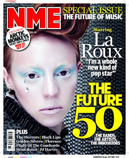
The music magazine I have chosen to analyse is titled, “NME”, which stands for “New Musical Express”. This has been chosen as a pun as it pronounced ‘enemy,’ which is a persuasive technique to lure the reader in. The word “new” indicates that the music is the most latest and recent so it’s more or less “in fashion” and “in trend”. “Express” represents how fast the music news will get to the reader and that it is up to date. NME is Europe’s most successful music magazine, with 16 million consumers worldwide and is published by IPCMEDIA.
The masthead is always done in bold blood red writing which contrasts with the background, which consists of dark monotonous colours; black and grey, so that it stands out to the human eye. The colour choice also fits in with the genre of the magazine as NME’s target audience is for those late teens/young adults who are interested in the indie rock genre and the colours red and black (which are on the cover) are associated with the rock and roll theme. The cover line and key articles on the cover are also made to stand out, by the use of colour. The masthead always uses a more striking colour, in this case red, which symbolizes its importance so that it is made recognisable and can be easily remembered by the purchaser. To continue, the magazine has stuck to only using 3 main colours; red, black and yellow, which refines the magazine and makes it appear to be more stylish and sophisticated. This informs the reader that the magazine maybe fairly expensive.
The main image on the front cover is of an alternative artist called La Roux. The image is a close up and La Roux is directly addressing the audience (direct mode of address) as she is using eye contact to involve the reader, to make them feel that she is addressing them personally and that each reader is her main focus. The picture conveys La Roux to be ice cold, as her make up is very wintery and she appears to have icy pale skin and light blue eye makeup which also represents coldness and ice. The two gems on the side of her cheek almost look like rain drops, or ice, which also adds to the wintery feel of the image. This portrays La Roux to be a very serious person, as she is pouting and does not appear to show any emotion. The way her makeup has been done, also makes her look futuristic, yet her outfit (from what we can see of it), seems to be from the Victorian times. This suggests that perhaps La Roux feels that she is trapped in the wrong period of time.
On the magazine, the significant words are printed in large bold fonts which makes it clear to the reader what is going to be included in the issue and grabs the reader’s attention. “THE FUTURE 50” (the main cover line) captures the audience’s interest as it is very “in your face” and we know that it is a core feature/article in the magazine as it is featured yellow and is the largest text on the cover.

Thursday, 12 November 2009

Kerrang front cover analysis


The masthead, Kerrang is very effective as it is onomatopoeia for the sound of a guitar, this automatically connotes the genre of the magazine, which is rock. Kerrang also uses dark imagery to indicate this. The guitar is an instrument mainly used in rock music so the reader can identify the genre of the magazine just by looking at the mast head. The typography of the title is done in a font which looks like shattered glass. Some rock artists smash their guitars after performing and this type of font may represent that. The mast head is covered up by a large image of the band, Biffy Clyro. This tells the reader that this is a well known recognisable magazine because the publisher feels comfortable enough to sell it when the addressees cannot see the whole title.
The main feature is of Biffy Clyro in a mid shot straight on so the audience can get a full view of the musicians in the centre of the page. It is an overpowering image which dominates the cover and is very “in your face”. The picture is very intimidating as their stance is threatening as the image is made to look like it is coming off the page and is about to jump out at you. The two back up singers are dressed in black and the lead in white, this makes him stand out and seem more significant compared to the others. They all have long hair and beards which tells the audience that they want them to focus on their music and not their appearance. The long hair on the central band member seems to be blocking his face which may symbolise that he is insecure. It also suggests that he has something to hide or that there is another side to him which know one knows about. The musician’s clothing is closed, barely any skin is revealed which shows that perhaps they are self-doubting or possibly that their faces are supposed to be the core focus as they are looking directly at the audience and they don’t want any distractions. By looking at the audience, this makes them feel more involved with Biffy Clyro and that they are being looked at individually which makes them feel important. The tattoo on the central band member is there maybe to portray something that the band stands for/believe in.
Kerrang applies dark deep colours to the magazine, using the reoccurring theme of black, red and white. The cover line contrasts with the background as it is white against a black background. The lighting is dark and dim on the front page and shadowing is used around the smaller articles and pictures below the main feature which are all of rock groups. This links in with the target audience, obviously the magazine is designed for those who like rock music but we can tell it is for males as the colour scheme uses dark colours which are associated with masculinity.
The front cover is very organised and structured which makes it look like a more high class and expensive magazine. Most of the typography is done in bold which makes words such as “free” and “plus” stand out. They are also done in block capitals which highlights the text to make it even more eye catching.

Top of the Pops front cover analysis


The masthead of the magazine to the left is Top of the Pops. The title is important as it connotes that the magazine provides the best information about the most popular music at the current time. It is a clear title which emphasizes that “pop” is the best type of music. “Top” and “Pop” rhyme which makes the masthead easily remember able for the young target audience that the magazine tries to connect with. The core audience that the magazine is trying to pull in is of young girls- pre teens, between the ages of 11-15 years old. To tempt and draw attention to this market of people, the magazine uses the colour pink to convey femininity. Pink is a colour associated with girls so when a potential female sees this magazine, they will automatically know that this particular magazine is aimed at/ made for them. The bold statement of the colour pink is aesthetically attractive.
The front cover is very busy. There are lots of small images surrounding the key image which adds brightness and is more appealing to the eye as there is a lot to look at. This makes the reader think that they are getting what they pay for as there are lots of articles on the front. The price of the magazine is £2.85 and is published weekly. This amount of money could be classed as expensive as the target audience is for female children, and to them, as they don’t work or understand money, may feel that it is quite expensive. In comparison to fashion magazines such as Vogue, which is priced at £3.90, this magazine would be ranked as cheap. Despite this, the cover manipulates the reader by presenting the reader with all the articles on the front page to make the magazine seem full and bountiful.
By the cover we can tell that the magazine’s media interests are of’; television programmes, “X FACTOR”, bands and music artists, “Jonas Brothers”, the fashion industry, “ Fashion bargains” and young celebrities such as Taylor Swift. The publisher, the BBC (British Broadcasting Cooperation), have used a pun, “Taylor’s Swift snog”, which is comical as they are using the musicians name to describe her “snog”. This shows us that the magazine is light hearted. The Top of the Pops magazine is a product from the popular television show, Top of the Pops. The BBC has created this magazine in attempt to cater for a mass audience as the tax payer funds the BBC, in which they have been very successful, with a circulation (point of sell) of 119.739 people and with a readership of approximately 393000. 87% of readers are girls and 13% are boys, this makes it clear that the magazine is aimed at young girls.

The typography is bold and simple which makes it undemanding of the reader, who will be young so therefore hasn’t acquired a full set of skills which enables them to read without difficulty. The magazine uses childish language such as “OMG” to bond with the reader and lures the audience in with words like “exposed” to arouse curiosity. Words like “Win” persuades the target market to purchase the magazine as it gives them a chance to gain an extra something from the magazine, often a luxury, in which they can take away with them. The main cover line, “”No more secrets” Jonas Brothers come clean about everything” lures the reader in, along with such words as “Exposed”, as its offering them an insight on the lives of those people that the person who reads may aspire to be like. They can achieve extra knowledge and become apart of those select few who also know the information; it would be the equivalent to joining a secretive club.
The main image on the front page is of the pop/soft rock group, the Jonas Brothers. The mode of address is that the band is directly addressing the audience by using eye contact. The group also appear to be very friendly as they are smiling straight the reader and their appearance is open and more relaxed. They appear to be laughing which makes it look like that they are having a good time and enjoying themselves, and young influential children may aspire to be like this. This manipulates the audience into thinking that the Jonas Brothers are welcoming the reader into their lives, they have been invited to join in with the excitement that the Jonas Brothers have, it makes the reader feel more involved.

Thursday, 15 October 2009

Music Magazine Research


NME

Launched: 1996

Cost: £2.20

How often it’s published: Weekly

Publisher: Faith Hill

Target Audience: Late teens/ people who like indie/rock music

Success: Europe’s most successful music magazine, with over 16 million consumers


Q

Launched: 1989

Cost: £20 per year

How often it’s published: Monthly

Publisher: IEP Media

Target Audience: Young adults who like rock music

Success: UK’s best selling monthly magazine


Mojo

Launched: November 1993

Cost: £2.80

How often it’s published: Monthly

Publisher: Bauer

Target Audience: Young adult males

Success: Very successful – second best monthly seller

Thursday, 1 October 2009

Music Magazine Brief

The music magazine I wish to create will be designed for the use of young teenage girls between the ages of 13 and 15. This is because I am near that age group so I can communicate well with that age group as well as understand what this audience want from a music magazine. It will be based on artists and bands which I feel young teens will admire and aspire to be like.
The magazine will focus on the most popular and current music which targets the audience as well as include exclusive interviews, gossip, posters, reviews, the latest music news and quizzes, as well as other forms of entertainment. The bands and artists will belong to the younger generation, between the ages of 13 all the way up to around 25 so that the target audience can relate to them and have young, professional and dedicated people to look up to.
I feel that there is a huge gap in the market of music magazines for young teenagers between the ages of 13 an 15, especially girls. At this age, children are starting to turn into teenagers; they are more grown up and are welcomed into the world of music and are starting to appreciate it more. As well, this is the sort of age group which are influenced by television channels such as ‘Disney’ and ‘Nickelodeon’ and the main stars and actors on these television channels have now started to sing and create music too. This shows that the magazine will be successful because the types of music bands and artists the magazine will be based on already have an enormous group of fans.

Thursday, 24 September 2009

Introduction to AS Media


For our AS Media course we have been told to design and create a new music magazine with two double page spreads. In our first 3 lessons we were told about the elements of the course and were introduced to photoshop. The coursework is worth 50% in our AS year and we have been told that we have to blog our progress throughout the course and to have word documents to back up our work. Our preliminary task was to create a front cover and contents page using Photoshop for our college magazine, 'Zine'.To the left, you can see my finished preliminary product.


“Zine” Magazine Front Cover & Contents Page Evaluation

The target audience for my design of the “Zine” magazine front cover is for teen boys who attend Woking College. I have shown this by using a fun fresh and original font which is eye catching and isn’t plain as well as a multi tonal blue background which is attractive and stands out. I chose the colour blue as it is a masculine colour and is usually associated with males. However, I smudged the centre of the background into a lighter colour to create a light baby blue which is a feminine, in case teenage girls were interested in the magazine. This would help make the magazine successful as the bright colours and imaginative font will draw the reader in. The writing on the front cover is informal, so this will encourage teenagers to read the magazine as the can relate to how it’s written as they will use the same type of language in their everyday vocabulary.
I have learnt that “Photoshop” is a very difficult programme to work as there are lots of confusing and new devices. I struggled with ‘‘Photoshop’’ as it was new to me and was very time consuming. However, I learnt that you could change the colour of people’s eyes, and even make their hair shiny. It is a very useful programme to edit photos with in order to make them fit in with your work and appear more appealing. I brightened and changed the colour of the model’s eyes on my main image, which was a boy to attract a male audience. This was to make them stand out. I also, lightened up the skin to eliminate shadows and covered a blemish using the tool, ‘‘Airbrush’’.
In my main task, I will include more images on the front cover to make it stand out more compared to other magazines. My contents page lacked images and text so next time i will add more to make it more eye catching and take pictures in a variety of shots. I will also make the main image cover most of the page to fill up space and to add more colour to the page and so that the audience can see the main feature clearly.
My contents page had the same background as my front cover as I wanted them to match. I wrote the contents’ text in the middle of the page as I wanted the reader to focus on the writing. My draft was drastically different to the end result as I originally based my magazine to be for teenage girls but the images I took were not sufficient as they were all blurry and didnt really suite the look which i was going for. Below you can see my plans for my original Zine front cover and contents page: